
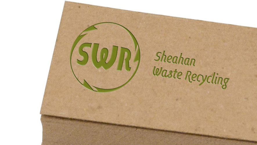
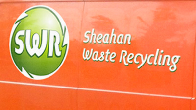
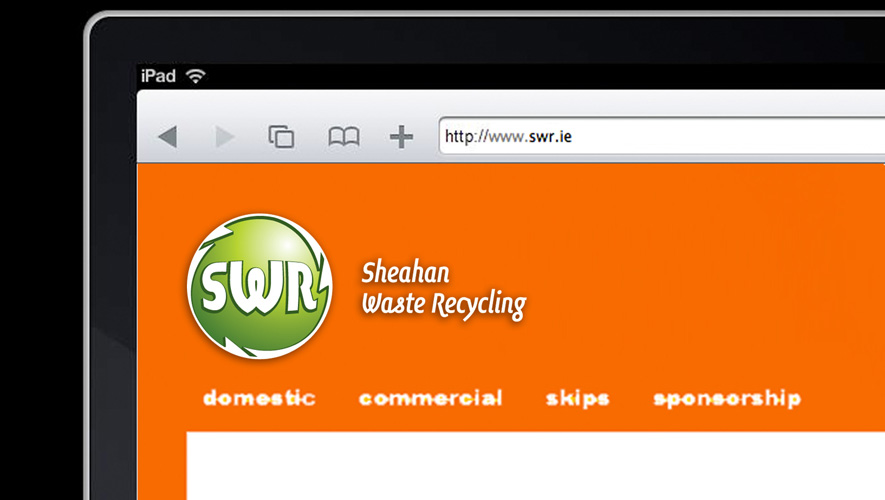
The client commissioned a logo for their environmental services and recycling company.
A lot of parameters were predetermined by the existing equipment, which defines orange as a background color (vehicles, website), and the clients preferences (SWR in capital letters, no black, full name as sub-headline).
The company is a start-up that is competing with well established brands, so the logo has to communicate professionalism and trustworthiness, while being clean and crisp having connotations of family.
Obviously, the symbols for recycling / environment are key features.
The client stated that, despite their short non technical brief, brand neu “delivered the perfect logo”.