


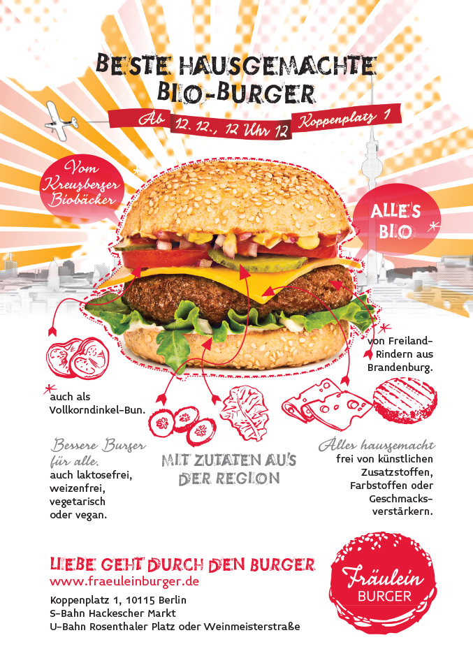
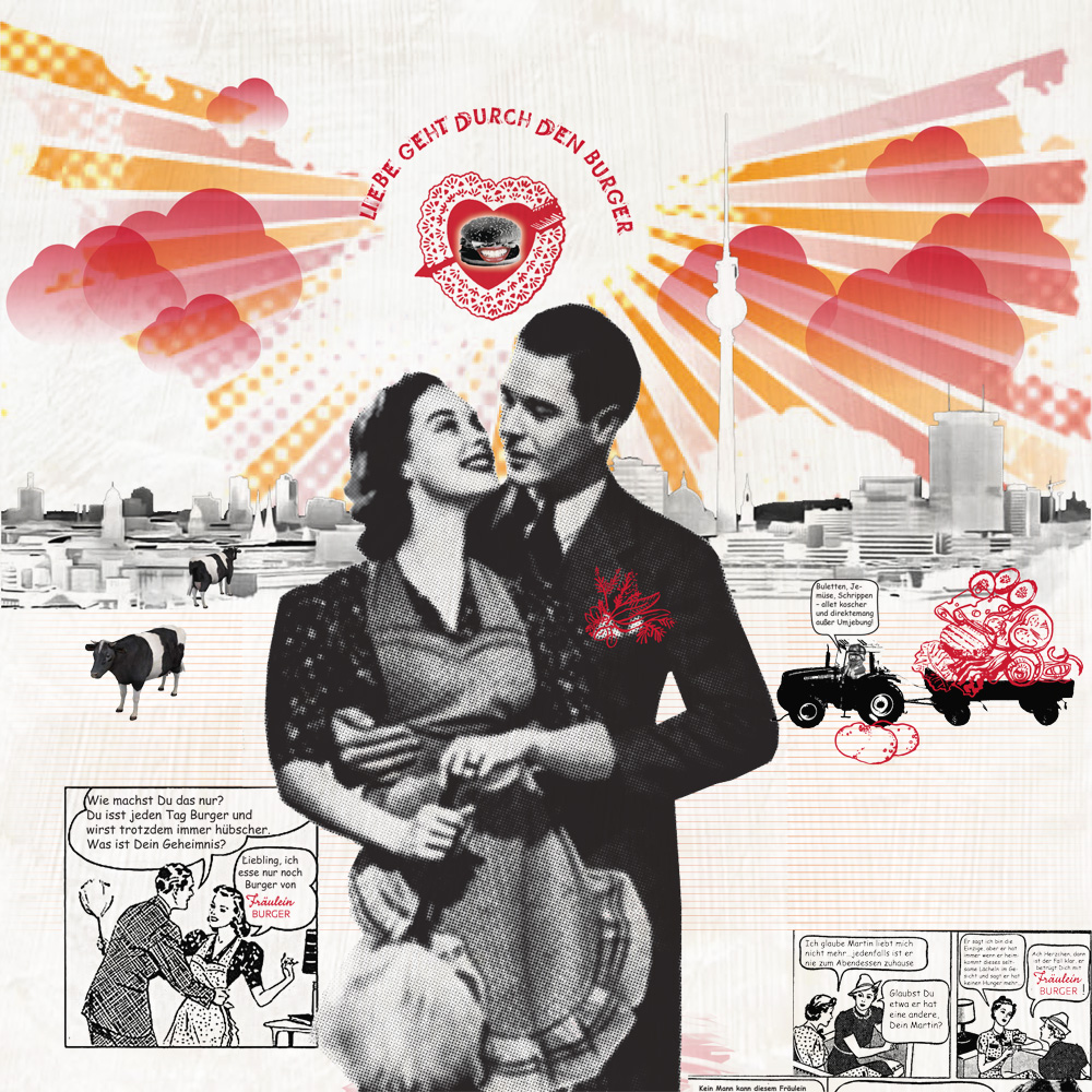
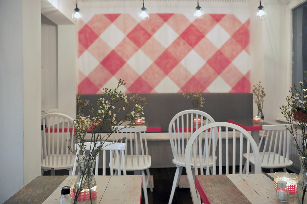

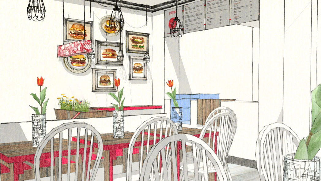

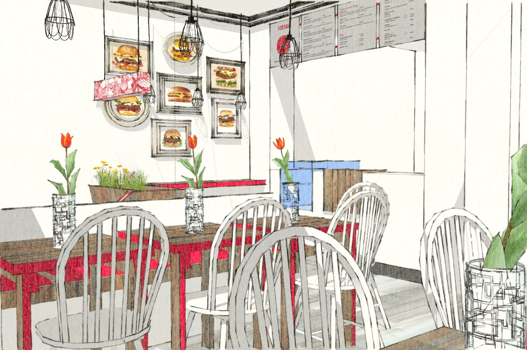
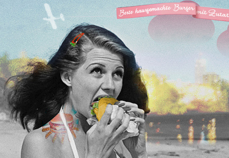
The visual identity of the “better burger restaurant” is a tongue-in-cheek reference to the fifties, the era of the German “Wirtschafts- (and Fräulein-) Wunder”, as well as an enthusiastic discovery of American culture and cuisine – far from simply adopting a retro look.
In 2012, Fräulein Burger‘s concept to bring the joy of excellent burgers back to Berlin was a novelty in the German food scene.
Far from simply adopting a retro look, Fräulein Burger is rooted in the present. Health-conscious Berliners are welcome to enjoy local organic ingredients, combine meat or veggie patties with classic, gluten-free or whole wheat buns.
The restaurant opened its doors in Berlin Mitte in December 2012, but had to give up after a couple of years due to the owners personal life changes.
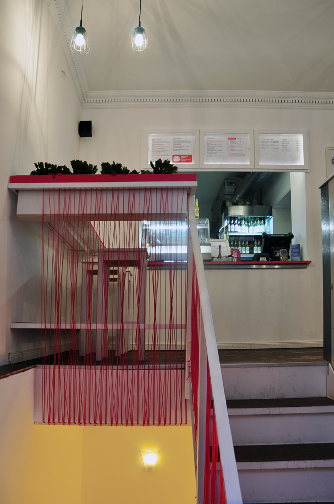
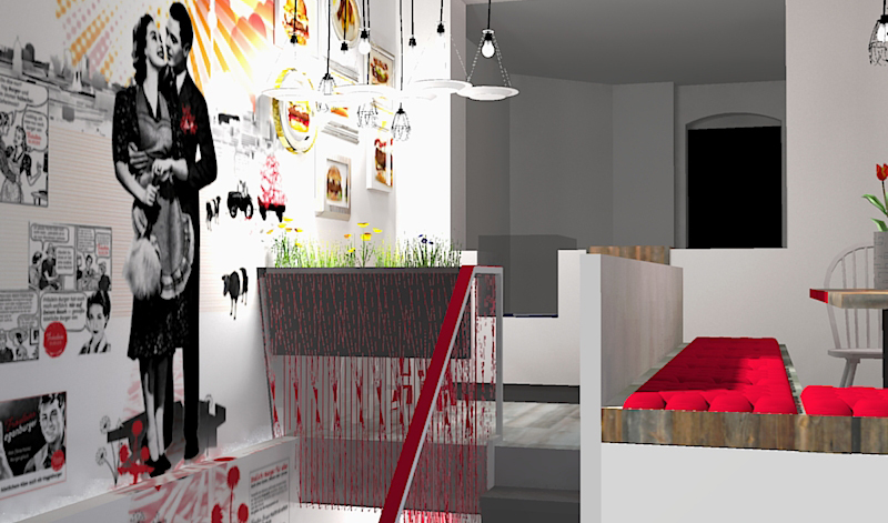
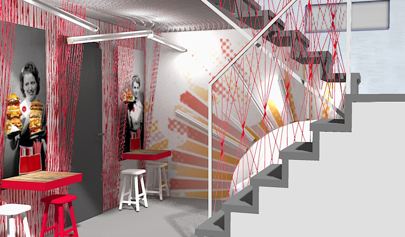
The collaboration of brandneudesign and Fräulein Burger was close from the beginning and helped to nurture a unique and sophisticated visual identity from early on.
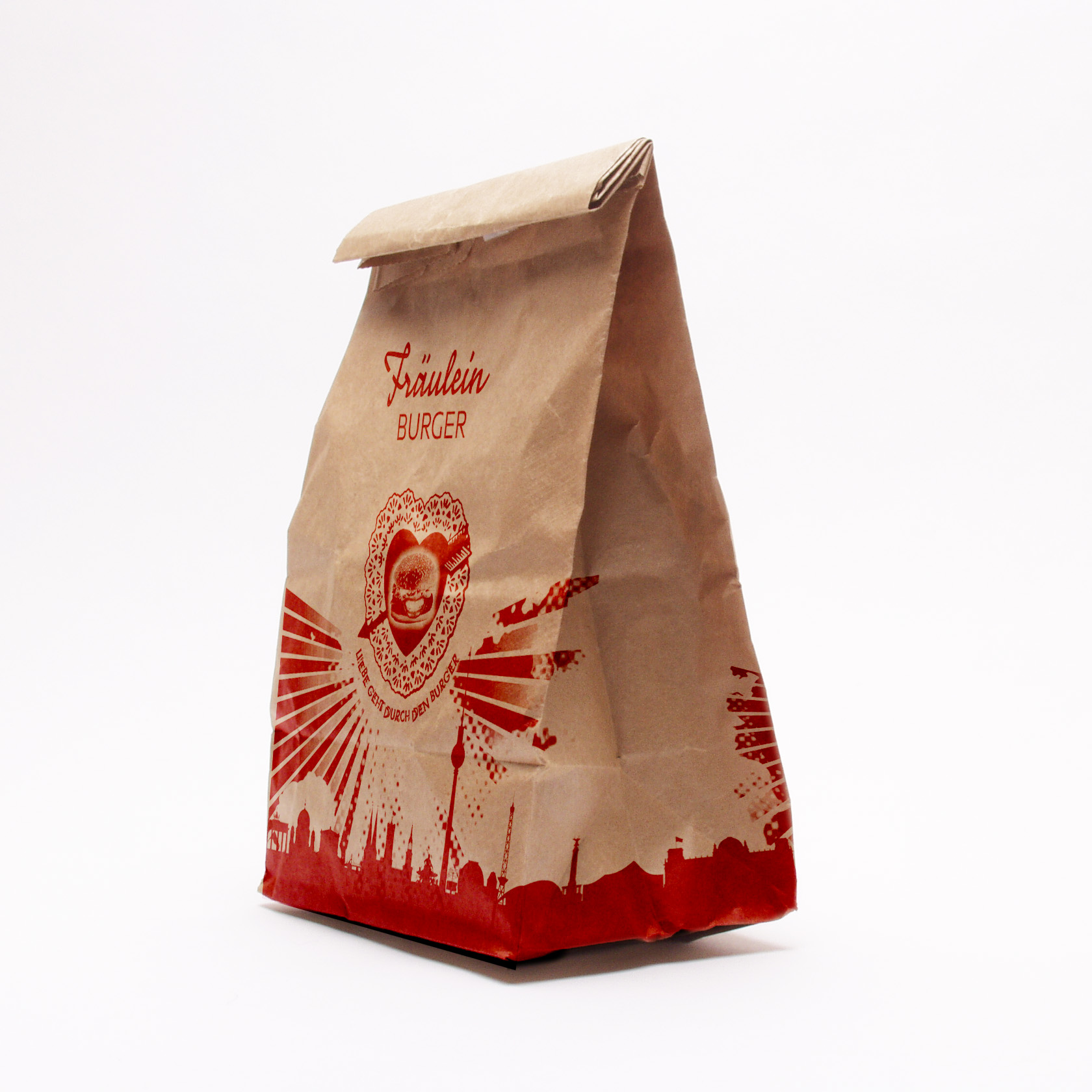
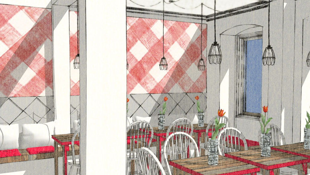
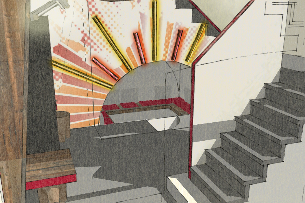
Concept development and design ideas were accompanied by frequent transatlantic skype communication, covering logo design, basic brand elements, layout for diverse stationery and promotion material, packaging design, website design and the entire interior design.